Provide Your Feedback – help us beta test the new torontopubliclibrary.ca
As you may be aware, we have been working on a complete redesign of our website. Starting today, we’re making the beta available to all library customers. If you’re reading this you’ve seen a link to it on the catalogue that looks like this:
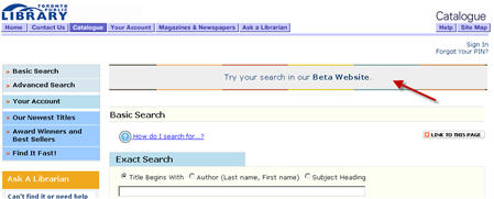
Over the next several days you may not see this link when you return to the catalogue so if you wish to review the site at a different time please bookmark the link. If you’re interested in why this is the case read here.
Since December the beta website has been in the hands of a limited group of our customers. You can read their comments and feedback here.
About the beta site
The old website and catalogue
are still available, but while you’re testing the beta, you should know
that all the data in it is live – the status of items (checked in,
checked out) is in real time and anything you do (placing holds,
changes in your account) is real. You are also seeing live program
listings and blog posts.
This is very much a *beta* and the website is still in development, so
some aspects are incomplete (e.g. no content on some pages or sections,
links that don’t work yet, some visual design and labels that need to
be finalized) and others aren’t quite working as they should.
If you’re looking for current library information such as policies, catalogue help and library board and service information, please go to our existing website. If you notice something isn’t working or doesn’t make sense to you please comment on this blog and provide your feedback. It may be helpful for you to take a quick look at the known issues list.
Why are you changing the site again?
The new website is the latest development in a multi-year plan to
improve the library’s online services and lay the groundwork for future
growth. In 2008 we replaced the computer system that manages our
inventory and customer accounts. This was a big change that had to be
made to support the library’s operations, but it did not directly
address many aspects of how our customers interact with the library
online. The focus of the current redesign has been on making the
website easier and more enjoyable to use.
So…what’s new?
- Improved search is the major change we’re
introducing with this redesign. Basically, we wanted to make searching
for library materials as easy and intuitive as searching the internet
or on an online shopping site. If you’re interested in the details,
check out our previous posts (part 1 and part 2) about how the new search engine works. - One site and search for everything: our existing
search tool (the catalogue) only searches for library materials. The
new website brings together materials (books, movies, eBooks, etc.)
with information about library programs, branches, and services. All
the library has to offer is housed under one site and one search. - Up-to-date web features: the new website has been
built to current web standards. This makes the site more accessible for
people with special needs, and also means we can offer the kinds of
functions (RSS feeds, sharing tools) that are found on most major
websites. - Fixes for issues on the existing site: in building
the new website, we’ve been able to address some of the things we know
you don’t like about the current site. For instance, we’ve done a
better job of ensuring that “Place Hold” links only show up for items
that are actually available for hold. And now entering your library card number
to place a hold signs you in, so you won’t be asked to enter it again
when you try to place a hold on a second item. - An extensible platform for future development: the
new website is built on a foundation that will enable the library to
react quickly to new needs and resolve issues. This includes enabling
open data, multi-language, mobile hand-held device experiences and
future features and growth.
But some things haven’t changed. Why not?
The focus of this phase of the website redesign was on implementing a new
search engine and web platform. We’ve been paying attention to your
comments about other improvements you’d like to see, and we’re planning
to address them in the near future. Some things you won’t see yet in
the new site, but that we hope to develop soon:
- Ability to delete the history of missed holds on your account summary screen, although they are no longer showing when you first login
- List-making functions, including the option to keep a history of items you’ve borrowed from the library in the past
- Self-service features like online payment for overdue fines and online library card registration
We rely on your input to help us prioritize improvements and new features, so please share your thoughts on this blog.
Here you go! http://beta.torontopubliclibrary.ca
211 thoughts on “Provide Your Feedback – help us beta test the new torontopubliclibrary.ca”
The search update is GREAT! Much needed! I can’tab out on books that I’m interested in rather than having to deal with one at a time, The advanced search function is great for searching library to library. This is a fantastic update and makes searching for books much better.
Help! It’s still moving! I feel sick! The moving introduction serious makes me dizzy. The scroll over is very abrupt; moving from the intro to the services. I hope you understand what I am trying to say.
The new website is so much better. One thing I would like to see is the possibility to see more than 50 results per page. Keep up the great work!
Very smooth looking. I like the quick link to new items and the ability to judge a book by its cover.
But that moving banner has got to go. At first I was annoyed because I couldn’t see the bottom of the page, but when I adjusted my screen to hide the “Beta” frame on the top it was fine. Still, for me to dislike only one thing from my first impression is fantastic.
I’m really looking forward to the List feature. That is one thing that I really can’t live without.
Love this new beta site!!!!!!
one more thing….when are you going to make the download feature available for all items on a mac? not everyone uses PC and that’s the one thing I find frustrating.
Hi Barbara,
Glad you like the site! Re downloadable content for Macs – unfortunately, Apple does not support the digital rights management (DRM) technology that publishers use to protect most of the eBooks they make available to libraries. We hope that with all the rapid changes going on in the digital content field, we’ll be able to offer more Mac-compatible eBooks in the near future.
great site and thanks for keeping it in beta before rolling it out. i tried searching for something and signing in to look at my account and see if anything is displayed differently. i like the fact that i can search the catologue in all meduims. the scroll banner depicting the city/library/people/stock images is a bit much. what you should have are stationary images as head banners that refreshes to a new image when the user does something on the page, like click a link. it’s a much faster site. as a library user who is online a lot and spends a lot of time at the library and on the tpl website, i appreciate this effort.
The beta site is great when compared to the original site. It feels much more ‘Web 2.0-ish’. I dislike the “Stay up-to-date” section at the bottom of the webpage. It adds unnecessary clutter and there is much unused space at the right side of it. It looks weird when compared to the rest of the webpage.
On the ‘Hours and Locations” page, I find it extremely unintuitive to have all library branches on one page. It makes for needless scrolling and slow loading speeds for people who still use Dial-Up connections. Might I suggest you remove about 90% of the branches on the page and replace it with a drop down box to view more branches? I find the moving banner on the homepage distracting. I’d prefer if you make it a static image that’ll move when the ‘Play’ button is selected.
Other than the aforementioned problems, the webpage looks great. The programmers did an amazing job.
I haven’t spent much time using the new site. One thing that I did notice when I first began looking at the site is that the site doesn’t conform to the W3C Web Content Accessibility Guidelines 2.0 (WCAG 2.0). Developing a site to conform to WCAG ensures that the site will be usable to the broadest possible audience, including persons with perceptual, motor function and cognitive disabilities.
Two accessibility problems that jumped out at me immediately after loading the homepage were the poor use of headings and the use of Flash.
I was happy to see that the new site uses headings, as the current site doesn’t use headings at all. Headings help to separate web content into logical sections and can be used as navigational aids for users of certain assistive technologies.
As far as the use of Flash goes, Flash is not an accessible technology. To be more specific, Flash is not accessible to users with certain disabilities on some operating systems, like users who are blind on the Apple OS X and Linux operating systems. The flash objects used on the new site’s homepage are poorly accessible to users who are blind on Windows, this is because many of the user interface components are not properly labeled, though I would imagine that the accessibility problems don’t end there. As a web accessibility consultant I discourage the use of Flash except where no alternative technology with greater accessibility is available. I would encourage that where Flash is used that developers leverage all of the accessibility features made available in the technology to ensure that the broadest user base possible can consume the content presented through Flash.
Technologies used:
Windows XP, Firefox 3.6, JAWS 11 (screen-reader)
OS X 10.6.2, Safari 4.0.4, VoiceOver (built-in screen-reader, activated with Cmd + F5 or FN + Cmd + F5)
Please do not institute this new website. The one now is simple and clear.
The introduction- the moving pictures. How can a user get rid of or stop this annoying feature? It gives me a headache.
I do like the layout of the new webpage. But please stop the moving pictures!
A couple of reasons you should get rid of the Flash scrolling picture show:
The winner the Pwn2Own contest two years running is quoted as saying that the main thing to keep your computer safe is not to install Flash! In other words savvy computer users will have Flash disabled.
The big moving picture show is distracting. It splits the two working parts of the web page apart. This is a working page, efficiency is more important than hype. Show off the fancy graphics on another page where you can do a complete song and dance routine about the library.
Many popular mobile devices are not going to see the picture show but the blank space will take up valuable screen real estate.
Apart from this the new site is good – especially like the new search capabilities – spell checking is espcially appreciated!
The moving banner has got to go. It is impossible to search for a book with that thing making you dizzy.
Please keep the website design you have now. It is simple, clear and so easy to understand.
About the Hours and Locations:
The usage of radio buttons on the page is misleading.
The radio buttons “Address, postal code or intersection” and “Keyword, branch or bookmobile name” are the “search by” types and really should be part of the title of the search box. Perhaps you need three lines above the search box – “Search by:” followed by the two radio buttons. The user is choosing what to search by and the radio button names act as the title for the search box.
The “Open Sundays” and “Open Now” are modifiers for the list and should be checkboxes. They look as if the are part of the search type radio button set at the moment. They are in fact modifying the content of the list that is shown. You could want those open Sunday and those open now.
It would also be helpful to be able to order the list either alphabetically or by distance from where you searched. This is probably and addition to the current functionality but would be really useful for mobile devices.
The catalogue search is much better with the options to narrow it down. Well done!
One thing I would like to see on the Hours & Locations page, perhaps below the map, is the letters of the alphabet with links to the beginning of each corresponding section, as it is on the current site. For instance, if I need details for Palmerston branch, I would click on the “P” and the page locatio would change to the first branch starting wih “P”. As it is now, I have to scroll all the way down until I get to the branch I am looking for.
“[T]hat moving banner has got to go” – I agree.
Greetings from Germany
Looks great. The only thing I miss is the old search bar (!) – it was nice to easily have either ‘title’ or ‘author’. To search a specific title, I now have to click ‘advanced,’ select from the field menu, then put my cursor in the search box.
Small layout issue: “Stay Up To Date” element is justifying left in Firefox 3.6
I like the concept of the flashy banner (the site does benefit from some movement on the page) but agree, the scrolling and roll-over is a distraction. Suggest fade in images, line scrolls over image element, crossfades to next image, line continues to scroll. Roll over results should be in a different area.
–Ted!
when i click on a library icon on the map on the “locations and hours” page, the window refreshes to a blank page and never finishes loading.
mac os x 10.6.2
firefox 3.6
also, i find the little shadows under each icon visually distracting and unattractive.
#summary-full div does not show the entire summary/review.
Consider: <“>http://beta.torontopubliclibrary.ca/detail.jsp?Entt=RDM2472609&R=2472609>
The displayed full summary is:
“Summary/Review: If the assigning of subject headings were fully democratized, it would be called tagging. Sure, librarians might recoil at the ensuing organizational chaos, but across today’s Web that is a minority view. Tagging, or to use Smith’s phrase,”
Whereas the XMLHttpRequest to <http://beta.torontopubliclibrary.ca/components/elem_bib-branch-holdings.jspf?itemId=2472609&print=
> used to generate that div’s contents shows:
“If the assigning of subject headings were fully democratized, it would be called tagging. Sure, librarians might recoil at the ensuing organizational chaos, but across today’s Web that is a minority view. Tagging, or to use Smith’s phrase, “people-powered metadata,” is at the core of social networking applications (e.g., Flickr, Del.icio.us, LibraryThing). Some argue that in a digital world it represents the future of information management. That might be a stretch, but there is no denying the power and utility of tagging systems, and Smith, a consultant specializing in information architecture, provides an excellent introduction to both their development and use. The chapter on creating tag databases for Web applications is particularly interesting. Yes, there is code for developing tag clouds as well. Readers may pick this book up wondering how such a simple topic could sustain an entire volume. However, after just a few pages, Smith will have convinced the reader that there is far more to tagging than suspected; a thoroughly interesting read awaits. Summing Up: Recommended. General readers; lower-division undergraduates through professionals. C. W. Grotophorst George Mason University.”
Why is the XMLHttpRequest generating a hidden html input element? Why not return complete JSON or XML objects that can be easily parsed instead of rendering full HTML tables for every backend request only to discard half the data anyways?
I like the new look, but as a web designer, I have a few suggestions:
1. Under New Titles – Great idea, but the pictures are so small it’s hard to read the titles. I’d suggest you switch it to one or two covers at a time, and provide names underneath for each one (make the widgets taller).
2. The rotating banner is distracting, and hard to look at. I think static images or a rotating flash banner (one image at a time) are great substitutes.
3. Some of the colours used on this site don’t provide sufficient visual contrast and might prove hard to read for people with certain visual impairments. The new fiction titles in purple on a grey background are an example.
4. I’d recommend taking out the redundant “To” in front of all the links that are listed. “To the latest from your library” sounds awkward as a title. It should read “The latest from your library” and, likewise, the links under the rotating banner will benefit from brevity.
Hope this helps – Great start!
Website looks great! Much faster and easier to use! Great work.
Hi jamon,
We’re going to move some code across this afternoon this will address the issues about the enriched content (summaries, reviews, author bios, etc). Our enriched content service provider (Syndetics) has recently rolled out some new AJAX-based features that make it easier to integrate this content into the new website.
So I agree 100% with what you’ve said and the new code should fix a lot of those issues. 🙂
Please do not use a Flash banner. And in any event, I don’t like the scrolling images: unsophisticated and not adding anything to the site.
This input area is incredibly hard to find – I was directed all over the new site before finding it!
Anyway: here is my suggestion (I first sent it to “contact us” because the initial feedback page I landed on simply gave me a “to be developed” message – said nothing about this page).
…
Love it! It retains the login after logging in from a hold request!
An observation: while the initial login from the hold request appears to pick up the preferred branch from my membership record, the next request gives the branch list to select from.
Which will probably mean that poor Agincourt is going to be deluged with misdirected holds again.
Suggestion: remove the choose-branch function from all the login pages & put it on the holds page as a redirect. Granted, it’s useful to be able to direct a hold to a branch that is different from one’s “home” branch, however, as the overwhelming majority of holds for an individual probably go to their home branch, the functionality for choosing a branch for redirect is overkill at the login level.
Helena
Please don’t tell me you coded this from scratch. Web facing Java? Are you serious?? Did you at least start with a Java CMS like Lenya or did you sink thousands of hours of development time into a custom solution?
I find it hard to find where to go to search the library catalogue. “To great reads” is pretty vague.
Hi – I like the new title section but can I suggest that if you have a new Adult fiction and New Children’s fiction title section you also include new Young Adult/Teen Fiction titles? With this genre growing each year you’ll have a wealth of material to choose from and we want to keep teen readers engaged and connected to the library system so having a section like that front and centre will be much appreciated. Thanks!
Re. Scrolling images on the homepage
Hi everyone. Thanks for all your great feedback – please keep your comments coming.
Just to let you know that we’re usability testing the scrolling images for now as part of our new Find Your Way online brand. Should we proceed with this approach, further development would be implemented to avoid the use of Flash. We’ve also been testing with a static banner.
In the meantime, you can’turn the animation off by clicking on the pause button below the banner.
Thanks again for all your feedback.
Nice work.
Couple of suggestions:
– Provide an easy link for feedback. It took me >30 seconds to figure out where to give feedback. Most people don’t wait this long.
– I don’t like the shade of yellow.
– Flash is on its way out, it makes my laptop’s fans sound like a jet-engine, and it’s not compatible with a lot of mobile devices. The same can be done using javascript libraries, e.g. jQuery.
Please stop the moving images!!!!
I can’t focus on the search or anything else. I’m back to the simple old catalogue.
played with it for 1 hr. this looks to be a MAJOR improvement. a few points …
* in search results, the logos for cd, dvd, vinyl, book, etc. (great idea!) look too similar. using contrasting colours or shapes (or both!) will allow me to quickly scroll down until the next item of my interest.
* in search results with multi pages, click to go to another page via a number button or the next button sometimes lands on an error page.
* my preference: after i sign in via the homepage (as opposed to sign in while trying to place a hold), i prefer to land on ‘your account’ page. currently it lands back on the homepage. see, the only reason why i sign in via the homepage is to check my account. otherwise i would just start using the site without signing in.
* the old site resets itself after a very short period of inactivity. i don’t know how the beta site behaves but i hope this annoyance can somehow be avoided.
looking good, guys!
Seems to be problems with Opera, sign in link doesn’t respond.
New features are good but your new interface is too busy and cluttered. Just keep the old interface and add the new features.
I like the general look and feel of it. I particularly like the new feature of searching for material in your own language. I didn’t see an advance search feature, maybe I didn’t look around enough, but it didn’t seem obvious.
Off to a good start. Once signed in with my account, I think “Your Account” should signal that I am signed in, perhaps by changing to “Hello, Bruce – Your Account”?
Test environment: Mac OS X 10.6.2, Google Chrome.
– where do I find ‘our newest titles’? This is particularily useful feature from the current system
– better system, thnks for eliminating all those irritating ‘OK’ and ‘GOBACK’ extra keystokes that didn’t work half the time.
– You can kill the home page moving images. On dial-up its just a waste.
– its just a little busy, more pages less content on each page
Love the new website. The ability to narrow a search down by the options on the left side of the screen is great. HOWEVER, I did a search where I narrowed my options down using several filters (by library, children’s material, publication year, etc.) and saw a few books of interest that met my criteria. I put the first one I like on hold. I got the Hold Confirmation screen with the “OK” button. I desperately wanted to go back to my filtered search list to select additional books, but I was dumped back to the profile of the first book and hitting Back took me through the Hold process I’d done!! Like the retail sites, instead of the ambiguous “OK” button, could you not have the options to (1) “Continue Shopping,” or in this case “Continue Searching” which would take me to my filtered search screen, or (2) “New Search”?
Like others, not a fan of the banner across the top.
Now the titles of Chinese books are displayed in Chinese in search results – wonderful! However I found that if I enter an author’s name in Chinese, the search results are not the same as when I enter the name in English. e.g. 亦舒 v.s. Yishu
I like the new search feature, but I am disappointed that you are using Adobe Flash. If you must use embedded video, why not use an HTML 5 codec? My iPhone can’t see the Flash information, and I will be getting an iPad in the near future as my eBook reader, so Flash is problematic.
Overall, I think the redesign is a definite improvement over the previous website (although I do find the current site still a highly usable website). Keep up the great work, and this website, I am sure, will be a great site soon.
Joey
Looks Great! Would love to see “music scores” added to the Type options list in advanced search.
Thanks,
Meri
“On its way for pickup” doesn’t make sense when N>1. “On the way for pickup” makes sense.
I love the new site, especially the option to open the details of catalogue search results on a new page or tab.
One thing I would suggest is to have “New Adult Fiction” and “New Children’s Fiction” on the Home page link to the complete list of new titles. Right now, you only have access to the three books featured at a time. Having those few titles featured is fine, but scrolling for the complete list isn’t that efficient. The alternative is to go to “Your Next Great Read” (which is kind of vague), then go to “Our Newest Titles” and then you have to further narrow your choice. For someone looking to browse new titles quickly, it’s quite a bit of navigating.
I also agree with the comments about the scrolling images being distracting as well as the “To” in “To your next great read,” “To business and finance,” etc. to be awkward and unnecessary.
Great site so far! The Toronto Public Library’s commitment to providing better online service is greatly appreciated!
We heard you all loud and clear, the moving banner and the flash are gone.
As for all the other great feedback, we’ll provide a further update shortly. Thanks and keep the comments coming!
So far I’ve only looked at the catalogue interface. It’s a vast improvement over the current one (which I never liked at all).
Good things:
*Signing in is more stable. It doesn’t automatically start a new session, wiping out your search history.
*Right clicking is possible on items in a hit list so I can open the item in a new tab and not lose my place in the original list.
Tweaks I’d like to see:
*Focus: When a page with an input field finishes loading, I’d like to have focus in the first input field so I can start typing my query without having to click first. And I’d like to be able to tab sequentially from field to field when there’s more than one.
*The advanced search needs to accept more fields. Personally, I will very rarely search from the home page — too many extraneous hits. E.g.: if I’m looking for The Hours, I don’t have the patience to wade through thousands of hits. So I want quick access to a screen that allows me to search ti=hours au=cunningham, michael (without needing to know the syntax), as the current advanced search does. U of T’s advanced search screen works well for me.
*However, I like the way the search limits are laid out in the beta advanced screen.
*The beta boolean screen doesn’t look useful to me in its present form. It needs multiple input fields or field operators as well as logic operators. And it should also provide the search limits of the advanced search screen.
*In the boolean search screen, the text “Type in boolean search terms here” should clear when I click the field or, better yet, when I start typing.
I often fall in love with prolific writers. When I do a search on the author (e.g. Stephen King), I would like to be able to sort the results by name of book. or publication date. This helps me check books in the Library catalogue and compare to my previously-read list.
You used to be able to do this prior to your last upgrade. Once you got a long list, it gave you the option to sort the results. It would be great if you could bring this feature back.
AND – I just checked the current catalogue, and with the Advanced Search, using the Sort option, finds more books (incorrectly) than the Basic Search.
Glad the scrolling banner is gone. i still find the flicking between the banner and the menus below very distracting. Can’t this be small pull down menus that flow out of the banner?
Bill Harnum
Nice! The search is a big improvement, and the overall flow is much smoother.
When you select Our newest titles & the Adult fiction category, it displays Adult Mystery & Sci-fi titles here too.
Thanks.
Specific comment: I just tried the beta advanced search function, and as far as I can see, searches which used to assign keywords to specific areas (title, author etc) now bring up any reference anywhere (eg words from the title in the author field etc). Maybe I need to use a special feature to achieve what I did automatically before, I don’t know.
A general comment: the old website works for me. I don’t care if it doesn’t look like a shopping site. The new one is very busy, has far too much information, and seems slower to load: the pictures are wasted on me. I’m sorry to dis your hard work, but my creed is if it aint broke, don’t fix it. I suppose when you instal the new version anyway, I will stumble through and eventually get something that works, but I’m tired of constantly changing computer features: I just want to use the sites: they can be in black and white typescript for all I need. I’ll use the old version as long as I can.
best regards
When checking the latest titles – eg Science Fiction, there seems no way to page through to the next item after viewing/Holding an item. The Next and Previous buttons seem to be missing.
I love love love this new Beta version…so much user friendly…visually appealing…faster than the old one…albeit still a bit slow for me…but I love it…
What about a wish list…or an area that we can put in our fav authors name and get notices when a new book is availble at TPL?
Love it!
Would like to see an improvement in search parameters, for example, would like to be able to exclude items that are for reference only.
Hi Kim,
You can in fact exclude reference-only items – this option is available on the advanced search screen and also as one of the refinement options in the left column on search results pages.
One feature I would love to see added to the library’s website at some point would be a function that would let you send recommended books to friends who are also library users….
It would also be great if recommending new books for the library to purchase could be done online…
Thanks,
Jody
Like the look and layout of the site very much, and welcome the “sort by” for authors and titles in new titles. It would be great if they can be sorted by alphabets, in addition to the pages, and it can even be A-F, G-L, etc.
Thanks.
the beta is great. so much faster and smoother than the old site. one of the new upcoming features i’m most excited to hear about is the ability to make lists of what i want to read, and better, what i’ve read.
The login page, and honestly any transactions should be secure.
Hi,
Why blue [BLUE]. I can barely see or read this colour of text. Is there a way to change the blue text to black. As a patron with sight and depth perception problems, I find that I am having more trouble using this homepage do to the excessive use of the light blue colour and the extremely tiny fonts.
Under “Get the latest” (which is vague – does this mean new title?) there are no categories for Arts, Humanities, Business, Nonfiction, Social Sciences as there were before. Again a clear system is replaced with indistinct descriptions. Please keep the old categories.
hi. i see it’s been a few weeks since my last comment, but i’ve been switching between using the beta and the old version.
anyways so i come to the tpl website today, before i head over to the library to return and pick up some stuff and on the front page is a huge green logo/link/info shape button at the top right corner of the page and you know i have no problem with it really except that the colour selection is no good, but the big thing is that this shape link is so huge and that it’s overlaping some of the traditional seperated links/headers at the top of the page that leads to different sections of the tpl website. i can see the white around the green arrow like shape and it’s (the white) is overlapping the blue headers. so if that’s a cut and paste job then it either needs to be reduces (size) or needs to be cut better. thanks. keep up the good work!
I’m just starting to try out the beta catalogue website… I noticed that when I’m searching a list and put a hold on one item, there doesn’t seem to be a direct way to get back to the list without using the page back on my browser, which seems clumsy. Did I just miss it? In which, my comment would be that it’s not obvious enough. Cheers.
I like the content on the new homepage. I haven’t tried all the new features out yet but I did notice a couple of things. The “Your Account” link and “Sign In” link on the homepage both take you to the same page. It seems a bit redundant to have them both. I’d like to be able to change the default hold pickup location in the “Account Settings” tab in my account. Thanks.
The advanced search function with the boolean method is very cool.
But you should retain the multiple blank field box entry method (as the current webpage,old style, still has and as UofT uses) for advanced search.
Boolean is still too complex for most people, who usu. don’t like symbolic logic notation (it isn’t just a question of intelligence).
But I like that it’s an option now.
And I add to others’ voices: the site looks too “busy”. There’s nothing wrong with promoting related events of culture on the catalogue website. But it is a fine balance.
Maybe your goal is to increase cultural activity in Toronto, tying events and program promotions to search results (or not), like a google ad algorithm. It may work.
But you have to work hard so it doesn’t take attention away from searching and make the experience more troublesome. That’s when it looks “busy” and tacky.
And you should allow a user to exclude the reference library from search results. This is a feature I wish the old cat had too.
If doing research, it’s great to have the Ref.Library in the catalogue so you get all the hits possible.
But if I’m searching for CDs that I just want to listen to at home and don’t care if there are others at the Ref.library listening center, I don’t need 20 hits to wade through, just to discover 2 that are marked with “place hold”. When, if I could exclude that library, I’d get two hits only, immediately. Much time saved.
Also, make the advanced search an option at the first search screen. Don’t force me to make a basic search so I can get to the advanced option. If I’m searching for a book on “cooking” by “john french”, I need to use the advanced search first, not to put in “french cooking” and get a thousand hits on french cuisine. And only THEN be granted the privilege of an advanced search to separate fields.
LibraryThing for Libraries?
I’m liking the beta version of the new site so far. Three quick observations:
1) I appreciate the improved search function with regard to “Movies and Video”. The search is now logical, in that it brings up all items in that category regardless of format (e.g. DVD and videocassette) and you can narrow search from that page if you want to select only one format or the other. It was frustrating before, because you had to make two searches for the same item (search # 1 for DVD matches, then search # 2 for videocassette if search # 1 brought up nothing). Thank you, my searches are now much easier and faster. On the other hand, I don’t know why they didn’t design the software that way in the first place, it would have saved time in fixing it. All they needed to do was visit Amazon.com or something similar to look for a great search engine format.
2) Typo. When you place a hold at Gerrard/Ashdale branch, the intermediate page in the holds process misspells the branch name as Gerrard/Ashedale.
3) I’ll keep hunting for it, but I don’t see an online form yet for title suggestions. This would be a nice service, and one that our neighbors at Hamilton Public Libary have had now for several years.
Good start to customizing large searches.
I would like to see a more detailed search available for movies only as I do not wish to read the book or spent any time listening to video cassettes. This would narrow down the search.Also the no hold allowed and DVD that are now over three years old is a definitely out of date. ex> My Winnipeg or Offside. And showing titles of movies that have 0 copies is a huge was of time and space. Keep customizing!!
Thanks.
yay! I had to quickly log in to put a few titles on hold and make a few holds inactive.
using IE8 everything loaded quickly, got in, did what I had to do and got out within 5 min.
even with the new UI, I was able to figure out intuitively where I had to click to get to where I wanted.
DasImbecil, when you know the title and author, you can do one search for author and title together at the same time in basic search. In your example, you can search for cooking john french. Here’s an actual example: big girl danielle steel
Just type everything you know in the search box and it works quite nicely!
Please reduce screensize to older, narrower format. Yes, means less info — but also means viewable by ALL without annoyance of having to scoll.
Good website! I like it! It looks much better than the old one. Thank you!
It would be better to watch more than 50 items per page. And could you post the list of all library options and clubs.
Hi,
I played with it for a few minutes, it is definitely better than the old site. In looking at the events, it would seem that some of them don’t have a year, so the search brings them up and doesn’t order them correctly or generally seem to know what to do with them.
I will try to find some time later to spend more time on the site.
Best Regards,
Stephanie Barnes
I had difficulty finding any links to the BookBuzz online book club via the beta site. I expected to see it listed in the Blogs, etc page, but ended up doing a search for it.
I’m impressed. The beta site is easier to use and to find branch information quickly.
I also like the recommended reads…will any type of “smart tech” be used to personalize recommended reads the way Indigo and Amazon do based on purchases or online browsing patterns?
thanks for fixing that green shape problem. no more overlapping. i like that the blue headers aslo have a minimal white space between the two on the right (help, site map) away from the rest. wouldn’t it be better if contact us was also on the help, site map section towards the right, although at the same time since the contact us has been right by the home link for so long now (i hardly remember the older versions of this tpl website. actually now that i think of it it’s bringing up some bad memories of some unfortunate colour schemes and logos/pics) and it’s more inuitive that way i guess, but somehow it doesn’t fit, maybe because more sites/people don’t do it that way. neve have i seen a home link and then a contact us link right beside it but i guess it’s kudos to the tpl for taking innitiative and keeping everything up front. but again wouldn’t the contact us link be better on the other side right beside help, and site map…
Where’s the return to my search button?
The old site has a go back tab which is very helpful.
Otherwise seems to be an improvement in searching.
I like the new design and the simpler navigation but I don’t understand why you didn’t use fluid elements, something that is pretty standard with most current web designs. I like to tile my browser windows. Yes some elements should be fixed but not all.
One other comment I would add as someone who has had to rework websites with multiple navigation bars. If you have 2 nav bars one will always conflict with the other and users will get confused. Better to use drop downs.
Any way you can set up the ‘checked out’ information page so that if I try to print it the due date actually shows up. Thanks.
OMG!!! This is sooooo much better…I LOVE IT….Good Job, guys!!! Amazing….the page looks so easy to browse through…easy to find ‘location and hours” …easy to find “your account” …easy to find “sign in” …Its JUST AMAZING…LOVE IT!!! Thanks.
I like the faceted search and the ability to limit to books or audio etc. And I like being able to display up to 50 items on one page.
I was doing a search for examples of children’s picture books of stories about the holocaust:
I’d like to know how the “children” filter works in comparison to using “juvenile” as a subject heading (in the old advanced search). When I used the “children” filter on the beta site I got some results that didn’t come up in a subject heading search for holocaust + juvenile on the old site (because “juvenile fiction” or “juvenile literature” has not been selected as a subject heading. Is beta site “children” filter based on location within the library?
Thanks
I think it looks great; I hated Yahoo’s email update, I hated Workopolis’ search update, but this I like a great deal. Two issues:
i) when trying to select dates within which to browse for Programs and Events, the calendar applet would not dismiss; I could still click the Find button behind it, but clicking a date didn’t dismiss it. The End Date didn’t seem to have a calendar icon. Start date should default to the current date.
ii) When I was in a Program (Sat Writer’s Workshop) when I clicked on the branch name (High Park) it took me back to the homepage, not the branch page.
But the look, feel and layout are great.
I use the library site two or three times a day. So far I’ve been extremely pleased with the Beta site. The only change I’d love to see is this one:
My bookmark for the library site is the Sign In page. I sign in, and then I search for the book I want. I’d like a search box on the My Account page, which is where I’m sent when I sign in.
Otherwise, really excellent job.
I LOVE the new site. The old one sucked big time.
I don’t use this function very often and don’t know what it is like in the current system, but on the account page of the beta I decided to suspend a book on hold and it allowed me to put in an end date less than todays date which it shouldn’t allow you to do. I noticed it and corrected it there. Maybe it would have picked it up later but its best to catch input errors up front.
….Steve
The site looks much better, and information is much more accessible, however, when i tried to find something as big as the twilight series, it didn’t really show me all matches for the search. when i typed in something random, it also didn’t ask me if i meant -blank-. these are just a few issues. thanks very much though! the holds i placed were much faster, and easier to understand. that part was completely foolproof.
Sign-in page needs keyboard focus in the library-card and/or PIN fields so one can just press Return when browser autofills.
Cannot place a hold from any search result in Opera on Mac, which also borks on the old site in various ways.
Can sort upcoming holds according to column headings, but that is not exposed via UI; it’s a secret that works when you click such a heading.
From any inside page, it is impossible to get just a normal search field without going back to the homepage. No, I don’t think “Books, blah, blah” or whatever it is at the top will do the same thing for me.
I know you all think it’s great, but the single searchbox sucks for anyone who isn’t a total beginner. Some of us aren’t.
This is absolutely a fantastic change from the old site!!!
Can you move the “Results Per Page” up to the top of the page? The number of Returned Results is shown at the top. But I do not know how many results are displayed per page until I scroll to the bottom of the list. I think the flow will be smoother if users can make the choice of display items per page based on the number of Returned Results.
I am very impressed by and appreciative of the continuous effort and dedication to the improvement of the website!!
Thank You!
I like the new site. Very easy to read and understand. I liked how you put the search limits on the left side.
I ran into some problems, though, when my session timed out. When I tried to put a hold on a book, it said to click the OK button to start a new session and so I did, but whenever I try to put a hold again, it kept giving me that same message. I tried to refresh the page, or start from the main library homepage, but same results. Even though my session has timed out, at the top of my screen, it still looked like I’m signed in (it has the sign out button instead of sign in). When I clicked on sign out, I was okay again. It was weird. I was timed out, yet I was still signed in until I clicked signout?
I’ve only looked at the beta for the first time this morning, I’ll start using it more now that I’m aware, but first impression is good, it’s well organized and clean. But an issue I’ve had with the old site, doesn’t seem to have changed here, is info displayed on Your_Account>Account_Settings, particularly the notification preference.
Long ago I set that preference to email from phone but how does one later change that setting or even know clearly to what it’s set? And how does one verify the email account, the input field is displayed empty. (This has been an issue for me recently as I’ve on occasion not received expected messages and have tried to verfiy settings). Same logic would apply to screen name, perhaps display options, French option, other personal settings. Make that tab into a summary screen of all personal choices that peripherally allows edit-on-demand.
Also, when in Your_Account, the top-right breadcrumbs are truncated. Reserve_a_Computer, Display_Options and Francais disappear. One could argue that removal is OK within a logged session IF those items have otherwise been included in Account_Settings but as it is now, user loses sight of the options and needs to make an extra click to regain them. It’d also be nice to retain the quick search feature while within Account_Settings; you’re just as likely to make a spontaneous search — manybe even moreso if you’re reviewing holds and checkouts — from here as anywhere else.
TPL is fantastic, you are appreciated!
I like the new sight; it looks very modern. I like that it remembers my location when I put books on hold. I would like you to add a feature that allows me to request an interlibrary loan on the website instead of having to fill out a paper application. It will save paper and it would be easier, especially if all my contact information is saved and automatically entered
I don’t know if I’m going blind but I cannot find the BACK key on the website to return to the previous screen.
I did a search, then selected an item that I wanted to see more information on and it opened the info page, but when I wanted to return to the search results, I simply could not find the link.
I know it must be there, somewhere. Where is it?
Thanks
and by the way, you guys are doing a great job redesigning this website.
Catherine
Text descriptions of some library items don’t display very well. I see nbsp; all over the place. Here’s an example:
THE STORY CONTINUES in the secondnbsp;volumenbsp; of nbsp;Hiccup’s How to Train Your Dragon memoirs nbsp;…
First impression of the new site compared with the old site is WOW!
I liked the old (current) version of advanced search much better. It is more user friendly in my point of view.
Some options are missing in the new beta version, such as: search for “series” that I myself use it very often.
“children’s kit” is also missing from the type of material we can search for.
Please put “ENGLISH” as the default language in the search page and save us some time!
Love the clean look and the tools to limit search on the left column. Excellent options for searches. Please stop the flashing/moving banners which service no purpose other than to irritate and distract.
The “your account” section is uncluttered. I like to see as many options as possible at one viewing without scrolling down.
Keep up the great work. I will use Beta Search from now on.
Hi, I love the new beta search site. However, I noticed that one of the official Nigerian languages “Igbo” is not included in the drop down list of languages whereas Hausa and Yoruba are. I believe this is an oversight that should be corrected.
Thanks,
Ernest
The recommended links box when searching is really annoying. It clutters up the page and provides completely unnecessary and irrelevant information. Is this being used for a small source of revenue?
The whole website feels somewhat more cluttered.
I’ve just gave it a whirl and I like the feel of it. I don’t have any detailed comments right now, but it seemed a little quicker and easier to get where I was going. One thing though. When you want to leave a comment and your press on the “provide feedback…” the first thing you see is a blog with a ton of comments. You should see the space to make the comment right at the top so that is the first thing you see. I had to zip around four pages before I guessed where I could enter a comment.
Rick
what happened to the “search by map” feature in the search for location & hour page?! The map search in the current (old) version is very handy and useful. I hope you will add it to your beta version.
My Account
Scenario
If I have 5 hold items and 4 of those are in transit. This results in 4 items in one section and 1 item in a second section. If I try to cancel the 1 item in the second section I get a message dialog asking if I want to change ALL items. This is very misleading. IF TOTAL_ITEMS_FOR_SECTION=1 THEN TREAT IT AS ITEM AND NOT GROUP OF ITEMS.
Nice look, easy search.
I would suggest to have a more visual access to `Your account` on the homepage (or I did not see it).
Good job!
i like that the current day’s branch hours come up when the branch icon on the map is clicked. what would be even better is having my default branch’s hours available in the corner once i’ve logged in, already loaded.
the new wesite is awsome and way easy to navigate.
Just started to explore and looking forward to learning about the site. I love that one can just click back to return to the previous page! I was always losing things because I would forget that I had to use the Go back tab.
2 things to remark on:
1. I miss the convenience of simple search bar’s quick drop down options that allowed users to select title, author or keyword rather than having to leave the screen to Advance search.
2. The search result window pane for authors. I like that the number of items by an author are listed in quotation marks but I would recommend presenting those results alphabetically rather than ranking them by catalogue items.
Also… Well done on incorporating websites/ Web 2.0 into the catalogue. It’s great to have access to some vetted electronic resources besides the e-books.
If you’ve misplaced your card (and therefore do not have a library card number), it’s a holiday, and you can’t go to a library to renew your books, there should be an online way to do so. Perhaps a “forgot your library card number” would be appropriate.”
Hi,
It’s taken me a while to find this comment page – perhaps a big button on the main page, and/or the catalogue page itself (maybe I missed it?) would help.
I like the layout, and although it threw me for a few minutes, I found what I wanted. I often search by subject, and so it took a while to find how to do that, but it worked ok. It took a while longer to find how to search for more than one term, or narrow a search, and I’d like to see on the Boolean page an instruction on how to truncate.
Otherwise, I can see this is going to be a fantastic improvement – I like that library programs etc. are included and it’s quick to see how to exclude them from the search.
Congratulations, and best wishes for the roll-out!
Frances
It would nice if books written in other languages, came up in those respective languages. It’s not very hard to accomplish, as all it takes it changing the font settings, during output. We’re living in a multicultural city, and the library should accommodate for it through it’s website.
Maybe I’m missing something, but I only receive email notifications for items ready for pickup and not overdue items. Even better would be notifications for near-overdue items.
· How about a simplified mobile/wap version of the site with limited functionality which can be used on both computers and smartphones?
– Typically this would be url’d as m.tpl.ca.
– It would be text-based with no graphics except perhaps a miniature TPL logo
– It would provide access to some key functions only e.g.
—> account access for checkouts, in transit, overdue and renewal only
—> basic search and reservation
—> service updates / important notices
Some examples of effective mobile sites:
http://mobile.reuters.com/mobile/m/Category/CBUS
http://www.financialpost.com/m/index.html
http://news.bbc.co.uk/low
https://www.cibc.mobi/
Other comments:
· The beta is less “fussy” and loads much quicker than the main site – good work 🙂
· Echoing some previous comments:
– dump Adobe Flash – often slow to load, open to Flash viruses, access may be disallowed in corporate environments
– reduce screensize to older, narrower format
– simple highlighted click points are better than radio buttons
– tpl main site doesn’t work too well with Opera browser
Why not add the ability to send e-mail notifications BEFORE items are due, as opposed to the current option of sending e-mail notifications when they are already overdue.
where is the next button when you have a bunch of relevant titles or hits – you seem to have to use the back key instead of being able to press next or previous
I like the new “deadline” feature when putting books on hold. It’s especially helpful for students who only need to borrow a book for an assignment. Also, the new site looks great!
Hi,
In the Programs section, (http://beta.torontopubliclibrary.ca/programs-and-classes/) at the bottom right hand corner, there is an icon for a calendar. When clicked on, the current month’s calendar will drop down, but then would stay stuck on the screen. There’s no way to get around it but sign out of the page.
I think the new site is great. Clean, bright, easy to use. Clear categories and fast search responses. It was not clear to me however that the huge search field should be by title or author or if this was just a site map type search. Great, though when I took the risk and got some quick results on the book I was looking for.
Strong branding and it is a great improvement over the current busy and outdated site.
Thanks!
Searched for upcoming events at Bloor/Gladstone, limiting to next 30 days. First item to come up was the May preschool story time, with the April preschool session at the bottom of the list. Shouldn’t items appear in chronological order?
In the account screen, on our check out items, the dates should be written as they are on the recepts. Instead of 12/4/2010, they should be written as April 12, 2010. It makes it much easier for people to understand.
This site looks great! I can’t wait until it’s out of beta. Good work, you guys.
Wishlist:
1. Checkouts and holds list would be easier to use if authors were included along with the titles.
2. Holds list would be easier to manage if it could be sorted by active and inactive status.
This Beta site doesn’t have the “go back” tab of iBistro when you go from checkouts or holds list into the catalogue.
I do like the fact that we can go from title in checkouts, then from author into a list of all titles by that author.
only used briefly but from what I’ve seen much better than the previous version. Layout is more intuitive and it is easier to find things. From an aesthetics perspective, colours are much easier on the eyes and more white space is visually less crowded and easier to read.
Please remember to put collection sizes — specific numbers –back onto the pages for the individual branches. This is important information, and should not be lost in the shuffle.
Overall, the aesthetics of the site are greatly improved, and I think that patrons will find it less of a hurdle and more of an invitation than they now do. Good re-design!
Team- I wanted to see this Beta version – now I cannot get rid of it!! All my desktops and views are out of whack since I looked at the library in Beta. How do I correct this?
I use a Macbook, OSX. Please help me to reset so that I can view my screens in their entirety. Thank you. Mary Britton
I would prefer that when I Log-in that it would go straight to my account rather than the home page.
I just found this beta site and LOVE IT.
Searching on the old site was very frustrating and it wouldn’t turn up the books we were searching for, unless we really were able to be specific. This one takes less information (one or two keywords) and finds the book we meant…right away! Honestly, we used to go to the Indigo website to find our books, and then go back to the library site to plug it in correctly, the search method was so poor. (TEDIOUS!!)
One request: we often are looking for the next book in a series, but unless the book cover says “book two” etc. it’s hard to figure out the sequence of books in a series. (we try guessing by issue year if it’s not indicated, but that’s not always successful). Perhaps this is a cataloguing format issue but if there is a way you could search by series, or list titles by series or even better….some kind of link to a series list, that would be life changing for this family of book addicts. (pretty please!!!).
I missed seeing my name at the account page, it seems very impersonal looking but we appear to have found that feature (to add a user name) so that I can see my name.
and for a real test, my 11 year old son Liam will give it a go. He figured out that typing TPL works earlier this year, without realizing that was intentional, so he’s pretty good at determining quick ways to do things. I’m sure he’ll provide you his feedback when he’s had a run through.
thanks, keep it up!!
Erin Armstrong
When you guys first came out with the ‘new’ website a couple of years ago (I actually have no idea when it was), I hated it. I found it hard to use, buggy, and unnecessarily complicated. It took a long time to get used to it. I still find it buggy, and have a lot of problems with it (it gives me A LOT of user errors, and then doesn’t work). This new beta site seems a lot more intuitive to me. I’m not a big computer programmer or anything, so I can’t speak to a lot of the issues other commenters are raising. However, when attempting to log in, search, place holds, navigate the site, I was able to do so without any effort at all. So, either you’ve managed to blue-print my brain while I am asleep, and build a site that runs off my neurological patterns, or this site is very accessible and intuitive. I find the latter scenario more likely. I would caution you to be a little aware of excessive glitz and clutter on a site. But so far, I find it vastly superior to the (never loved by me) current site.
A couple of things. The “Your Account” on the top of page after login should be a drop down with clickable links to the holds/account/search functions etc. And a lot of the navigation is still rather counterintuitive – the link is hidden in text instead of stand-alone. Overall it’s a good design but it’s still cluttered with text and doesn’t provide a really fast flow through. You’re packing a lot of text together – open it up a bit, you’ve got the room.
But the biggest thing is still the need for mouseover dropdown menus instead of having to click through extra unnecessary links.
would like to see languages collection size show up in the list of languages – I used your arabic collection example and could see the several branches that had arabic – but not the relative size of these collections.. having a sense here of the size would be useful so i could choose which branch to go to to find a large collection.
thanks
Award Winners: Many of the book award categories you used to show are gone. The missing ones are mostly for “genre” books. For example: Hugo, Nebula, RITA, Agatha, Arthur Ellis. Bring them back please! I read SF, Romance and Mysteries and these lists introduced me to some great new authors.
Hi,
I notice there is no “Next” button for going from one item to another on the list of search results. I found the “next” button for going from results page to page, but not between individual materials.
Would it be possible to add that?
Otherwise – it does require an extra click to go back to the page with results and then click on the next record. And if you do that for many materials, ti is many extra clicks.
Thanks.
Yana
I very much like the new look…very clean, crisp and simple. not overcrowded with info and details where one has to stop and think, read before it’s determined where they need to go.
Good links and easier search for material too.
awesome
At first glance, I’m impressed. The beta site follows the modern conventions of the web much better than the existing site. Looking forward to seeing it move from beta to live!
I’ve put a book on hold but unlike the old site, I have no idea how many holds there are ahead of me. That’s a drawback to the new site.
I went back into my account and look at my holds and found the information there. But didn’t it automatically inform us before?
I think having the two buttons YOUR ACCOUNT and Sign In is redundant. Either button would be adequate provided it is easy to find since both buttons take the user to Sign In.
I generally like the design, but unfortunately it doesn’t work well with Opera 10 browser i.e. I can’t renew books with it as the buttons don’t work.
How can I do a search by call number? I don’t see an option for that, even in the advanced search feature.
Clicking on either of the main links on this page didn’t do anything. It took me a while to figure out that a sublist had appeared on the left that actually was helpful.
Today was my first time on Beta website–I was having trouble on main site placing a hold / locating the movie “A Time to Kill”. When I tried on the Beta site, my search worked immediately and I was able to place a hold for the item very easily. Like it!
The new site looks great. Used it to reserve a book and all went well. Will continue using it and will advise if I any suggestions.
Regards.
I would like a search bar at the top of each page or possibly one of those fancy in browser search bars. It would make it a lot easier for me to quickly look something up on the tpl website. This way I don’t always have to go back to the link at the top of the page. Thanks.
I really like the beta look. I’m really excited to see it actually get implemented. It would absolutely make me return to the site.
I do book searches for my mother who is a voracious reader. I scour the “new books” online section (and I do judge a book by its cover, at least at the beginning…). This beta version of the catalogue makes the process incredibly easy including being able to use the web browser’s arrows instead of the one that used to be on the TPL page. There are also some other technical changes which I can’t describe exactly other than to say when I find a book I want to put on hold, the whole process seems faster and when I return to the big list of all books it takes me back to exactly where I left off. The old version always took me to the top of that page which was a pain having to scroll down to the next book in the list after the one I just put on hold. This beta version also seems more stable in that none of the book cover images ‘disappear’ when I toggle between the screens (I was never sure if it was a problem with my web browser or the web site). All in all, I am going to start using the beta website exclusively from now on.
Re: Flawed Renewal Process
The TPL system doesn’t allow me to renew a book when there’s a hold on that book – even when there are plenty of copies available in the system. Recently I wanted to renew Middlesex, which the system reported having 121 copies of, but only 28 holds. So why not let me renew my copy online? Instead, I have to go to my branch, explain to the librarian there are 121 copies in the system and she usually renews my book manually.
Could you please :
Leave Home Page setup and all the information as displayed as is on existing home page of the site. The new beta version home page not so user-friendly and can’t find titles of services available easily.
Also, On Maps/Hours of locations page please list the intersection for each library location besides the address, hours, etc., in the listing on the site as well as on ‘list of Branches Hours and Locations’ that are distributed at the library.
Thanks
With the old site getting to home (first button on left hand side under the TPL log)is quick and intuitive. On the Beta site once you navigate from the homepage there is no home button or any intuitive way to navigate back to the home page, or if there is it is “hidden” somewhere.
I just tried to send a comment without creating an account and I got an error message so I created an account and will send my feedback again and apologize if you already received it.
Basically what I said was that on the old site getting to home (button located in the upper left hand corner, under TPL logon) is intuitive given where the home button is located and that from a usability perspective a persons cognitive process automatically moves to the upper left hand corner when looking for something given that is how we read a page (if raised in a culture that reads in that manner. With the new site this isn’t the case. I have searched and searched for a home button or link and can’t find one so basically when you navigate away from the home page you can not navigate back intuitively.
Hope this helps. This is a great new site.
It would be helpful if the login would allow me to choose which library card number I want to use. In other words remember more than one card number and give a drop down of the those numbers like the old site does.
From the beta site, clicking Library homepage took me to the old homepage, rather than the beta homepage. This is obviously wrong, and incredibly incompetent programming. Anyone writing software this bad in the private sector would never be hired, let alone fired the first time they made such an incompetent mistake.
I just took out an ebook from the Overdrive list. Number one, it took me an incredible number to clicks to do so; just a ridiculous, unbelievable number of links, that no private sector company could possibly get away with. No one would buy such incompetent software from a private sector company, and the company would go bankrupt. If only it was possible for the Toronto Public Library to go bankrupt, and then hire some competent workers as a new startup. If only. I was also forced to sign in twice, once to the Library, and again to Overdrive, even though the sign in page was exactly the same. Even the sign in of a bank isn’t that grotesque and baroque.
Please, fire all the programmers the Library has now, and hire new people who can actually do the job. Thank you.
A great improvement, thank you. The search drill-down and pictures of book covers are very useful.
Other than that, could you extend the automatic logout time please? When I search for books I often google things about them as well, and by the time I come back to the tab I’ve been logged out again. The session timeout is much too short. Thanks.
Would love to get emails a day or two before books are due. Would cut down on overdue items by a lot. Contact me and I can provide psychology study evidence for this.
Great work on the beta site! I love it and use it exclusively now! Much faster!
I recommend putting the Account login in a more prominent place on the new landing page, possibly in its own portlet. Putting it in the top bar makes it difficult to see/find, and doesn’t really give justice to the importance of this feature for library users.
After placing a hold for a book, this site no longer offers to option of going back to the listing.
Hi,
I’m liking the site redesign. One thing that I think would be useful is having the search box available on my account page. So if I am reviewing my holds and notice there is a resource I want that I have not yet put a hold on then I don’t need to click away from my current page to conduct a search.
Hi,
I love the new website, but there was a slight delay in navigating through the search results. Clicking on the Next and Previous buttons seemed to respond quickly. But when you press on any of the numbered page buttons (1, 2, 3, etc) it seemed to stall and wait for the results to appear.
But otherwise, I love the layout fo the site and the usability.
That’s my 5 cents worth… 🙂
First time in and it is a very confusing site, Hard to find things and some of the boxes of info look more like advertising as seen on Google or Yahoo so make me afraid to click on things.
Finding this feedback form was very difficult, especially for older eyes.
In the long run still better than the original site but you may want to get more feedback from seniors and those who do not use computers a great deal.
First of all, let me say I absolutely *LOVE* the beta site, especially the Search feature. It’s so much easier to find items and I love the automatic classification of results (e.g. books, perioidicals, video, audio, etc.) Kudos on a job well done!
I noticed one possible problem – I no longer get any kind of notification (email or phone) when my items are ready for pickup. This resulted in 2 holds automatically expiring. I just “re-reset” my preferences (via the beta site) to be notified by email. Note, I don’t have a spam filter enabled – I’ve been getting email notifications from the TPL without problems until now.
Thanks!
–Ravi
I see you are still using the old dd/mm/yyyy
date format in our due dates or hold dates.
I would suggest the International Standard
(ISO 8601) date format of yyyy-mm-dd.
This is also the date format adopted
by the Standards Council of Canada.
.
The federal government uses the yyyy-mm-dd
date format in most of our application forms
(including passport application forms) and
in our income tax forms.
.
The Ontario provincial government also uses
yyyy-mm-dd in our driver’s licence and OHIP cards.
.
This comment is submitted today,
Monday, 2010-04-26.
I think the site looks good but I don’t see significant functional improvements for users who want to browse and search the collection on-line. For example, while browsing, I saw an interesting DVD title that was part 4 of 6. When I opened the record, I was hoping to see the other related items, so that I could get to part 1 of 6 without having to start a new search.
Also, I think it would be great to see patron reviews along each item. Ideally, the reviewers would also be evaluated by the people who read their input. Eventually, top reviewers would surface as credible patrons.
Keep up the good work and good luck!
Won’t let me into Beta site — error message is “Invalid session URL received from iBistro”
If I hit Place Hold on a book and I haven’t sign in, on the next page it asks me to sign in and which branch to put the hold on isn’t selected, it goes to my default branch after entering my library card number. That’s great! I don’t have to scroll the list to find my branch, just sign in.
Thanks!
I have notice in the Beta, that 2 holds that I wanted to place had a note saying reference only not holdeable, but I was able to place holds in the old catalogue.
1st title was: Wife of Reilly
2nd title was: Eve of the Isle.
Why does this happen? they were both just fiction novels
thanks
Everything looks pretty good. I’ve been using the site for 20 minutes or so now. One problem I have with it is the session expiry. Why does my session expire after about 10 minutes such that I have to click to refresh my session? This isn’t required on any other website that I know of. I just don’t understand the logic behind this “feature”.
The beta site is clean and refreshing. Easy to navigate. I suggest making a mobile-friendly version, or possibly an iPhone app, for easier access from mobile devices.
Hi,
Maybe have the “Place Hold” button change to “Item on Hold” or something to indicate that the item is on hold for that user. Right now the only indication is if you try to put another hold on the same item you get an error message.
Thanks
Chris
Hello Beta-Team,
Thank you for creating such a nice new library site. I really appreciate your efforts, particularly with regard to the search function.
If possible, please consider the following suggestions to further improve the site:
– the option to display up to 100 search results
– the option to exclude certain characteristics or include several (e.g. display books published in English and French)
– the possibility to save search preferences (see google) – e.g. always search for books that you can borrow, in English, etc. and display 50 results at a time
– I like the ‘refresh my session’ prompt – however, not if I am in the process of searching for something. It should only be displayed in the case of inactivity for a certain period of time.
– it would be very helpful to be able to save search results for a certain period of time
Thank you for your continued effort 🙂
I really like the beta website. Much improved version. Thanks
There is an encoding problem with at least one book description. Here are the details:
Text: Leo Gursky is just about surviving, tapping his radiator each evening to let his upstairs neighbor know he’s still alive. But life wasn’t always like this: sixty years ago, in the Polish village where he was born, Leo fell in love and wrote a book. And though Leo doesn’t know it, that book survived, inspiring fabulous circumstances, even love. Fourteen-year-old Alma was named after a character in that very book. And although she has her hands fullâkeeping track of her brother, Bird (who thinks he might be the Messiah), and taking copious notes on How to Survive in the Wildâshe undertakes an adventure to find her namesake and save her family. With consummate, spellbinding skill, Nicole Krauss gradually draws together their stories. This extraordinary book was inspired by the author’s four grandparen’ts and by a pantheon of authors whose work is haunted by lossâBruno Schulz, Franz Kafka, Isaac Babel, and more. It is truly a history of love: a tale brimming with laughter, irony, passion, and soaring imaginative power.
Technical Details:
Browsers: FF 3.6.3, Chrome 4.1.249.1064, IE 8.0.6
Default Encoding (none set in HTML): UTF-8
Tried 8859-1 and 1252, but neither is right. The ‘copy and paste’/’data import’ process may need some character scrubbing systemically to sort this out – feel free to contact me if your vendor doesn’t have a plugin for this.
In the “Get the latest…” section, please add “Adult non-fiction”! that’s what I’m most interested in.
And if there can be a section for new “non-fiction” DVDs as well that would be fabulous.
Everything else look great!
Nice…much better than the current production website. The session management is so much better, and info about whether an item can or cannot be checked out is good. One small bone….when I click on the printer-friendly version in a list, I’d like the printer-friendly version to contain all the items in the list, not just the particular page I’m on, i.e. if a list has 12 pages, give me a printer-friendly version with all items from the 12 pages.
Like it better- Will there ever be a place in my account where I can see my checkouts history?
I hate to take out a book and discover half way that I already read it- a history of checkouts would help avoid this.
Thanks!
I love the redesign of the TPL site. It’s easy to use and now I can see all the events going on at the libray. Excellent!
I would include the search box even with the “your account” pages. I’ve been on the site several times while looking at my outstanding holds, etc, and wanted to search for a book but need to return to another page to do so.
The beta site is a big step forward. Great work!
http://beta.torontopubliclibrary.ca/books-video-music/books/newest-titles.jsp
No link on New Titles page not Non-Fiction.
the site displays that my session is timing out even though I have just loged in. Other than that, the beta site is a vast improvement over the older one.
Keep up the good work.
http://beta.torontopubliclibrary.ca/search.jsp?Ntt=%3Cscript%3Ealert('boo!’);%3C/script%3E
Great job on the new website. I like it a lot, especially after reading your feedback to the feedback and understanding what some of your reasoning and outstanding issues have been.
I only have one comment. It’s finding a library. I love the big search bar, and that works well for books I’m tracking. Can we make it do the same for a library search? For example, I type “Annette library” or even “Annette” and it would return (as one of the options) the location and hours of that branch.
I often find myself having to check my local libraries to see which one is open in the evenings or on Sundays/Mondays…and this always seems to involve multiple clicks. (I guess I’ve gotten spoiled by Cinema Clock!)
Thanks,
Julie
trying to place hold from search results sometimes results in the following message, even though there’s practically no time lapse between conducting the search and placing the hold:
Hold Confirmation
Your catalogue session has timed out. Click OK to start a new session.
http://beta.torontopubliclibrary.ca/search.jsp?Ntt=%3Cscript%3Ealert('boo!’);%3C/script%3E
In the olde good times in the list of the signed out books there was a column with the author’s name. The next two versions (including the beta) don’t have this feature, although there’s a column titled Title/Author, but it’s hard to figure out how to display Author.
Best wishes.
C
I have just had a chance to lok at your beta site:
After doing a Search, I wud appreciate the chance to save it, either directly to a disk,(floppy or otherwise); alternately give me a chance to email the results to myself for later perusance. I sometimes have a gap of 2 weeks or more since I worked on the topic. It would be helpful to review what I had done b4. ?? Wud appreciate yr comments.
Best Regards. Site loks very good. and amy dying to try out you faceted search approach. Regards. Mark Mon 20Msy2010.
Hello,
I would like to be able to see only listings that i can put a hold on instead of getting both reference and holdable items.
The site seems to move fast but it kept timing out when placing holds.
I have tried several times today to sign into my ebook account with no luck. But the same library card number and password do still work to sign in to my regular library account. Is there a new glitch in the system?
When I will search using the beta website for books, I noticed, in comparison to the original (not beta) library website, I find greatly less relevant findings for my searches; additionally, when I go to ‘hold’ specific books, although I think the specificity is random, I am told my search or of the like has timed out and I must confirm, and when I click “OK”, nothing changes, thus I try again, same error message, and I resulting cannot ‘hold’ the book. A the same time, I went to the original libary website, searched the same words, found greatly more relevant results, and successfully placed a ‘hold’ on the same book I was not able to. I did try signing out and in with the beta website, and that did not help.
The beta site does look much nicer =D, and I would greaty enjoy it if this problem did not exist.
This is awesome! The new library catalogue site is simply world class, and I appreciate the ability to middle-click on links to open them in a new tab very much.
Although the hold system isn’t working right now, another nice touch would be to have it remember where you requested books to be delivered the previous time. There have been occasions when I’ve accidentally sent books to Barbara Frum rather than Bayview, and doing so would save some shipping.
I find it odd that when I log in to my account, I am thrown back to the Home Page and have to click on My Account in order to see account information. I actually expect to see the Account page after logging in.
I believe the current login functionality to be a very non-standard usage. I can’t think of another website that does it this way and I find it annoying.
— The problem I mentioned previously about the sign in going to the Home Page only occurs when logging in from the Sign In link at the top of the Beta Home Page.
This problem does not occur when loggin into my account with the My Account link at the Beta Home Page.
Also, both of these should not be showing at the same time (two ways of logging in?).
It’s great so far – what would be really great is if there were some way to store a choice that you don’t want to place a hold on right now but would like to park in a personal database in order to retrieve the item and place a hold at a later date. You know, something akin to a ‘shopping cart’ or ‘wish list’ a la Amazon.ca
Cheers!
I wish that it would keep my sign in information since I am on a secure computer it is a hassle to have to re-enter all the time since I time out
The new site is looking good. One comment/feedback that I have is when searching for a book, the returned book used to display Holdings for all the locations where the book is kept and their status. I didn’t see this in the new beta site. Has this been removed? You should definitely keep this as I found it one of the most useful features.
Thanks.
Well, this was hard enough to find. If you want feedback, why not put the response button in a noticeable place. Or label it as “PROVIDE FEEDBACK HERE”
I use an Acer netbook. Small screen. When the box comes up saying my internet session is about to be ended, I can’t renew it, because the box is too far down the screen. And I can’t grab it and move it, so that I can see the whole thing.
I understand web developers work on the full screen — but library users will use a variety of screens. Make it functional for everyone. Test it with everyone. Netbooks will become more and more popular, and they are already the it-thing among teens.
And that “catalogue session has timed out” thing better be fixed quick: it looks like you are policing how many books someone can ask for. Or their behavior using the catalogue.
Finally, this has been very frustrating.
On Hours & Locations page, there should be a key to the library symbols. What does red and blue mean?
The portion of the screen available for the mouse to activate “your account” is a smaller feild in the beta site than the usual site. Since the “your account” space is such a narrow strip, one has to control the mouse very well. It will make it difficult for a person with motor or visual disablities. Personally, this came to my attention, when I was in a rush to access my account and I needed to take a breath to relax enough to aim my mouse to activate that icon. Actually, TPL had enlarged it in the past.
Appears that the search list (at least for new items) has only 10 per page. Would be nice if this were customizable, e.g. display 25 or 50 items per page.
Don’t like the nagging pop up window asking me if I still want to stay logged in. If you’re going to have it, at least give the option to not be nagged anymore (and still have the standard logout after n minutes of idleness).
Otherwise, much better than current production system.
I really like the new web site. I found it very easy to use and very helpful for me to determine what’s on and when and where.
I go to a number of branches and wonder if it would be possible to select favourite branches and be able to download all programs at those. Maybe 5 branches. So not only branch by branch, or all programs, but favourites that would be associated with my login.
When I did a search, it came back with 17 pages, so I tried to change the display to give me 50 (and then 25) results per page instead of the standard 10… and it kicked me out to start my search over again.
I was able to filter results fine by other features, but couldn’t change the display. Since I was looking for something that would have been toward the bottom of the list, it would have been better if I could (1) display more results per page, or (2) skip to closer to the end without having to go all the way to the end.
Great for searches, but did not show the holds I requested.
Keeps on telling me my sign on is timing out. Is this necessary when I am browsing on info about the book I might be interested in borrowing?
I like the new design of the website. But we desparately need more epub books!!
I like the new website. But we need more epub books. The selection is dismal.
The “Hours and Locations” is not interacting with me very well.
When I type in my postal code, the map does not put pinpoints on nearest locations. It merely states what city I’m in. I would like to see the map show nearest locations according to my postal code or major intersection I type in.
Hi Justine,
Sorry to hear about the problem you’re having with the Hours & Locations map. We haven’t been able to duplicate what you’re describing. Could you provide some more details (what browser you’re using, exactly what the map looks like after you do your search)? Thanks for the feedback.
Hi Justine,
Thanks for this report–I can’t get this to replicate consistently using Internet Explorer 7 or Firefox 3.5, but I saw it a few times while investigating. I’d originally thought it was connected to postal code parsing–“M4W 2G8”-style postal codes seemed to work correctly, but “m4w2g8” didn’t.
I can’t get this to replicate now, though (bugs that can’t be consistently replicated are always the most fun to investigate).
Which browser (including version) are you using? That can help us further investigate.
It appears Sandra completed her reply shortly before I completed mine. 🙂
The “Read blogs by Librarians” link at the bottom is broken.
Looks great!
FEATURE REQUEST
Would be great to have a “save for later” option. I just did a quick “place hold” in the new interface and I didn’t see this option. It would be really handy to keep a running list of books I’d like to read in my Toronto Public Library Account.
BUG
When I signed in with Facebook Connect, it deleted the comment I was writing.
I work in web usability and I really love the direction you are taking with the new site. I like that you are letting users/tax payers give feedback as well. One thing I tweeted today, why is the Hours and Location not front and center? Is “Using the library” just as important information as “Hours and Location”?
Ever since the new library website was launched, I could not access the site. What happens each time is the old website comes up on the page. Then, when I click the new website link on the top right corner of the page, the page freezes. It defaults to the old website each time and shows the URL:\\betatorontopubliclibrary.ca
This is frustrating because I have always used the online to place a hold and check my account. Now, I can’t do any of this on my home computer.
What changed?