Account redesign update: let us know what you think of the latest design
 Post Updated May 9, 2014:
Whoa! you guys have eagle eyes. We've looked at this a lot so your fresh perspective is fantastic. Commenters: you're all quite right, highlighting holds in the navigation was a mistake and I've updated a new version to correct that. The previous summary screen you commented on is right here for your reference.
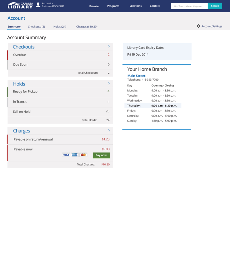
Back in January, we asked for your input on an early mockup of a new design for the account summary screen. You gave us so much great feedback, we went right back to the drawing board – literally! We did a bunch of whiteboard sketching to help us move towards a revised concept.
The main point we took from your comments was that the summary should focus on its core purpose: letting you see the current state of your checkouts, holds, and charges at a glance.
But there's more! We've been doing a lot of technical work since January. Our primary goals for this project are to make a great experience for customers and also to create a platform that moves the library forward so it can deliver more of what you want, like borrowing history and lists.
A lot of new technical bits under the hood are being put together, and all on top of some newly minted servers. We're building out the new account using Ruby on Rails and are implementing a number of tools to make ongoing development a lot easier and more efficient (Maven, Jenkins, Capistrano, Git). It's quite a number of platform changes and we're happy to elaborate on this If you want to know more, so use the comments below and let us know.
So without further ado…we invite you to take a look at the newest summary design. Tell us what you think in the comments below.
12 thoughts on “Account redesign update: let us know what you think of the latest design”
Great to see this work underway! Quick question — in this mockup image, shouldn’t the highlight bar be under the ‘Summary’ rather than ‘Holds’?
Secondly, in the checkouts area, it’s a bit weird that there isn’t an entry for ‘checked out items that have lots of time left’ (yes, I know that’s not articulate — perhaps ‘Recently checked out items’?). The reason it’s weird is because you’re expecting ‘Total Checkouts’ to sum up the lines above — the same way that ‘Total Holds’ and ‘Total Charges’ are sums of the detail lines for their respective areas.
You might want to consider giving an indicator in paren’theses of how soon ‘Due Soon’ is. [i.e.: Due Soon (within 5 days)]
Keep up the great work.
Great new look, much easier to read and understand.
Further to Nathan’s valid comment about checked out items, i imagine the total items checked out would appear when you click the arrow to the right. However, perhaps to make it clearer, next to the word Checkouts you could add “(Total: 16)”, and link it to the total checkouts file.
The new design looks great and very user friendly. Is there any way that this could automatically be the home page when we log into our accounts instead of having to click on “Your Account” to get to that information? The primary reason I log in is to look at my account information. Sometimes if I’m browsing the virtual “stacks”, I will click on the place hold button and then sign in if I want to reserve something. I never log in first and then browse the stacks.
I agree with Nathan on all points!
I, too, got thrown at first by the fact that it looks like a summary page, but the Holds tab is highlighted. Over it now.
I can see this working well on a phone, with the double columns collapsing to a single column.
“Checkouts due soon” is vague and undefined. Are they due tomorrow? The day after? Next week?
It might make sense to move the checkouts and holds totals to the top, rather than the bottom, of their respective sections. I know the current setup mimics a spreadsheet, but since, in terms of Checkouts, I’m not seeing numbers that add up to the total, it doesn’t need to be presented as a final sum.
Why are account settings way off to the right side? Are they going to function so much differently from everything else that they can’t just be in tabbed section and grouped with the others? Is that where I log out, or do I use the apparen’t menu at the top left by the logo? It’s not clear to me.
My library card expiry date is probably the least useful information on this page. I don’t think it needs to be so prominent, or even needs to be on the summary page at all. I do like seeing my home branch hours.
Total charges should include the credit card processing fee first, then the “Pay now” button, so I know exactly how much I’m going to pay if I choose to pay online.
I’m assuming that clicking/tapping on the section arrows will result in the same action as clicking/tapping on a tab heading, yes?
Great feedback, your suggestions are very helpful. We’ll continue to tweak. Keep the comments coming.
Why are you using red and green for anything, let alone emphasis? Why are there two levels of emphasis?
Why are rows that wide? Is it because you want to fit in the credit-card logos? Then make that row double-height. These are short words and the numbers should be close alongside. (Or do the smart thing and put them to the left of the word, flush right.) You seem to be influenced by decades of reading telephone books and equally-ill-designed tables of contents.
Just put the totals in the headings, which I assume are actually HTML H2 through H6. We aren’t adding up a Loblaws receipt and we don’t need a full line for totals.
“Payable on return/renewal” will not be understood by anyone. “Fines for items still out” works better.
My home branch does not need blue lines at top or bottom. I would remind you of the fundamental principle of graphic design: 1+1=3.
Again: Why is TPL not hiring an actually qualified designer (viz Andy Clarke) instead of going it alone? How can you expect different results with the same people? I certainly don’t want to hear a response of “We prefer to hire local.”
However: At least you’ve stopped using Helvetica.
Hi,
I agree with David that the credit or debit card processing fees should be presented as well. I don’t think it necessarily needs to have its own line, but perhaps it can be included as a permanent line below the card logos and pay now buton (in font the same size as ‘total changes’)? Just so people know what to expect before clicking ‘pay now’.
On that same vein, I often deposit money onto my account for photocopies, printing, etc. and don’t end up using the entire amount. Thus, I often carry a negative balance to future months. I think a line presented as ‘outstanding balance’ would useful to show any outstanding amounts, either positive of negative, from prior weeks/months/years and whatever negative/positive amount is there can be summed to the total payable.
Alternatively, since this is a summary screen perhaps neither of the credit card charges or negative balance needs to show up? For example, when clicking on pay now the user could be taken to another page to enter card details, and then see the charges to use card payment, and any account credits. At that point the user could have the option to pay full amount or use any credits to reduce the amount payable (ie. a box that says ‘if available, use account credit against balance owing’).
The option to use the credit could be useful for a paren’t or teenager that has allocated that credit for photocopying/printing, and instead of paying twice (1: online for balance minus credit, 2: in branch for photocopying), they can just pay once (1: online for full amount owing, credit still on account to use in branch).
I find it interesting that someone who uses Zapfino feels they can make snippy comments about design…
Is there a public repo on Github (or wherever) for people to contribute pull requests?
Sorry for the late reply. Good question, we’re considering how we make code public but priority one is to launch these improvements. We’ll keep you posted through this blog about what’s made available in Github.